CSS subgrid vs nested grid — are they the same?
A look into what is the CSS subgrid and how it differs from a nested grid
The CSS subgrid is a new feature coming to browsers. It's already supported by Firefox, but the Chromium team is also working on the implementation. The CSS subgrid allows grid items to be included in the grid layout by adopting the grid tracks and grid lines for the area they're spanning over.
Obviously, the subgrid only makes sense if the grid item spreads across more than one grid cells (you can achieve that by either using the grid-column and grid-row properties or creating named grid areas).
By default, the children of grid items are not part of the grid layout. Without the subgrid feature, you need to create a nested grid and recalculate the grid tracks if you want to replicate the grid layout for the nested grid.
However, a nested grid and a subgrid are not the same thing.
What is CSS subgrid?
CSS subgrid is a value you can add to the grid-template-columns and grid-template-rows properties of one or more grid item, for instance:
.grid-container {
	display: grid;
	grid-template-columns: repeat(5, 1fr);
  	grid-template-rows: repeat(3, 1fr);
}
.grid-item {
	grid-column: 2 / 5;
  	grid-row: 1 / 3;
	display: grid;
	grid-template-columns: subgrid;
	grid-template-rows: subgrid;
}
Using this syntax, .grid-item will adopt the grid tracks (rows and columns) of the grid container for the area it spans over (in the above example, three columns vertically and two rows horizontally, defined by the grid-row and grid-column properties).
What is a nested grid?
A nested grid replicates the grid tracks of the parent grid, however it's still an independent grid.
You can use the inherit value for the grid-template-columns and grid-template-rows properties of one or more grid items to create a nested grid, as follows:
.grid-container {
	display: grid;
	grid-template-columns: repeat(5, 1fr);
  	grid-template-rows: repeat(3, 1fr);
}
.grid-item {
	grid-column: 2 / 5;
  	grid-row: 1 / 3;
	display: inherit;
	grid-template-columns: inherit;
	grid-template-rows: inherit;
}
Using this syntax, .grid-item will copy the grid tracks of .grid-container. However, it will divide up its own area into five columns and three rows instead of being included in the grid layout of .grid-container as a subgrid.
The difference between a subgrid and a nested grid
While a nested grid is still independent of the parent grid (we have two grids), a subgrid is a part of it (we have one grid) as it gets included in the same layout — using the same rows, columns, and lines.
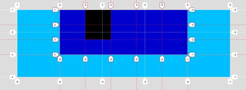
For instance, here's an example of a nested grid when being inspected with Google Chrome's grid inspector. As you can see, the parent and nested grid have independent tracks (marked with white vs red):
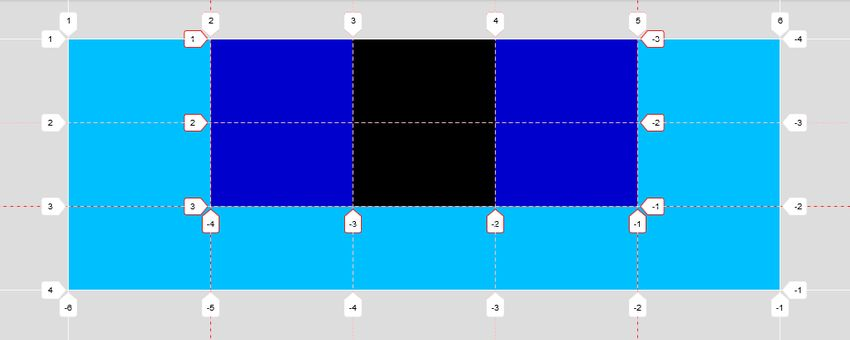
While, if we create a subgrid, it uses the same grid tracks as the parent grid:
Read more
This post is the recap of my longer article about CSS subgrid published on TutsPlus Web Design where I analyze the question in detail (the two screenshots above are from this piece as well). I also show how to simulate a subgrid without having access to the subgrid value (even though this simulation is not perfect, as we still have two independent grids).