Link accessibility – Colors are not enough
How to make hyperlinks accessible for everyone
Link accessibility is one of the most important aspects of usability. However, designers often don't understand what it takes to make links accessible. Most frequently, they only distinguish links by color, which makes it hard for users with visual disabilities to spot them in text blocks — even if high color contrast is used.
As a rule of thumb, accessible links shouldn't rely solely on colors. Partly because users with low vision, color deficiency, and other visual impairments can't always recognize this kind of link, but also because it's easier for regular users to skim through the content if links are better emphasized.
However, it's not always easy to find out how to create accessible links that match your website design. It's also possible to overdo it by using too many visual signifiers that might confuse the user.
Link types
When we speak about links, we usually think of the classic blue links with an underline, however there are actually different kinds of links, such as:
- body text links,
- headline and subtitle links,
- menu links,
- buttons,
- image links,
- video links,
- audio links,
- and more.
In this article, I'll only speak about the first group: body text links. Don't read it as a guideline but rather an experiment for understanding what can be done for more accessible links.
Accessible links according to WCAG 2.0
According to WebAIM's guidelines about links and hypertext, WCAG 2.0 has two additional requirements for body text links:
- The link text must have a 3:1 contrast ratio from the surrounding non-link text.
- The link must present a "non-color designator" (typically the introduction of the underline) on both mouse hover and keyboard focus.
Web browsers come with a default link styling that meets these requirements. You can check it out by disabling all additional CSS styles using the Web Developer browser add-on or another dev tool. For example, this is how the homepage of the Mozilla Developer Network looks like in Chrome:

It's a very basic styling for sure, but it's still styling: the underlined blue links are well-known and internet users can easily recognize them. It's not a coincidence that the Nielsen-Norman Group also names blue the safest link color choice in its "Beyond Blue Links: Making Clickable Elements Recognizable" article.
Examples of accessible links
WebAIM doesn't recommend removing the underline using CSS, as "users are accustomed to see links underlined". Still, many of the biggest websites don't follow this principle of link accessibility. Many times, they don't only remove the underline from the default link state but also the :hover styles.
But, why do they do that? Mainly for aesthetical reasons, however underlined links don't necessarily have to be plain-looking and boring.
1. Border-bottom
For instance, Bloomberg uses the border-bottom property to mimic an underline in a different color. As you can see below, the link texts are black while the underlines are blue, which gives a stylish design to the links.

Perhaps Bloomberg's links could further benefit from bold letters, but it's a good example that underlines can be used for links creatively, not just in the usual way.
2. Reverse underline
The Verge uses a different approach to create underlines for body text links. Here, underlines are present by default, however they are removed when the user hovers over the link. When the underline disappears, the color also changes subtlely, from pink to magenta (however this color change is barely recognizable).
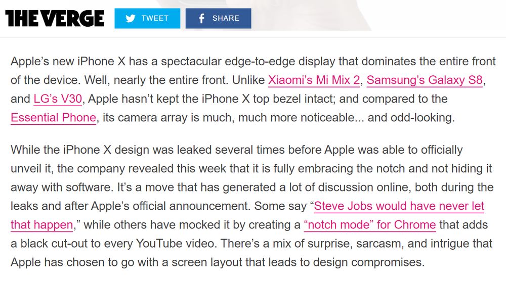
The presence of underlines in the default state helps readers easily notice the links, even within large text blocks. And, when they hover over the link, the state change is instantly visualized by the disappearing underline. An unusual choice, for sure, but it still follows the principle of using non-color designators for accessible links.
3. Icons
You can also help users recognize links by adding tiny icons next to them. For example, some news sites add a video icon next to the links that point to videos (however, embedding videos is a more widely used practice these days).
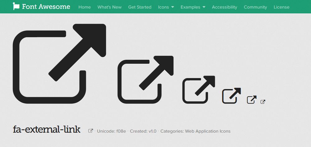
WebAIM chose an all-inclusive solution for link accessibility. Besides the underline, they also add a small icon after each external link. In this way, the icon doesn't only serve as an extra visual signifier but also clearly distinguishes external and internal links.
You don't necessarily need to create a link icon by yourself. For instance, Font Awesome has an external link icon that you can quickly add to your links.
4. Link text
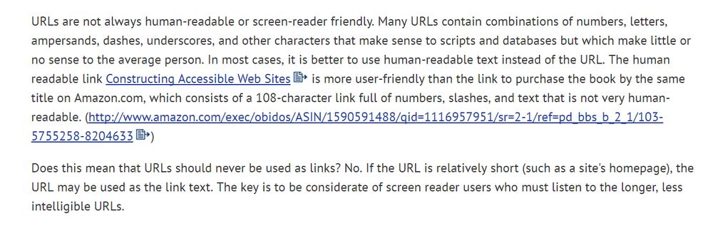
As screen readers notify users when they come across a link, it's not recommended to use phrases such as "link to" or "follow this link" for the link text. Instead, you should provide link texts that describe the main content of the link. It makes it easier for users to decide if they want to click the link, which is especially important for users with cognitive disabilities.
WCAG 2.0 even has a recommendation on how to provide proper link texts, with a handful of useful examples (mainly for image links, though).
If you want to see an example of proper link text I would mention the Gov.uk website that publishes governmental information in the UK. For example, check out their Set up a business page.

Have a look at, for instance, the Find out more about being a sole trader and how to register line on the screenshot above. Note that they put the anchor tag on the part that describes the purpose of the link ("being a sole trader and how to register") instead of the action verb ("find out more").
The controversial role of the title attribute
The role of the title global attribute in link accessibility is an interesting question. If you add it to a link, the extra information appears somewhere around the link when users hover it.
For instance, take the following line of HTML:
<a href="#" title="Extra information">Hover this link but don't click it.</a>It's displayed like this in the browser: Hover this link but don't click it.
I've long thought that adding the title attribute to links is a good practice for accessibility, as the extra information helps users understand the purpose of the link. However, WCAG 2.0 has a slightly different view on the question.
On their "Supplementing link text with the title attribute" page, they mention several accessibility problems. For example, the title attribute isn't available to assistive technology and keyboard-only users. Besides, it disappears after about five seconds in some user agents, which usually doesn't leave enough time to read it.
On the whole, WCAG 2.0 doesn't advise against the title attribute but recommends careful usage. One thing is sure, never use title for important information that is not available in another form, such as warnings. On another note, if title can be used only for unimportant information, is it worth using at all?
Link states
There are five different link states, represented by CSS pseudo-classes: :hover, :focus, :active, :visited, and :link.
It's an open question whether it's better for accessibility to style all link states differently or not. If you use different style rules for each state, users are notified about every change indeed, however is that always a good thing? Too many state changes can cause information overload and confusion to the user.
Personally, I tend to create one style for the default link state, a second one for the :hover, :active, and :focus states, and sometimes a third one for :visited links. However, I still can't tell if this is the best solution for accessibility. If you are interested in the topic here's an interesting StackOverflow UX discussion on whether the styling of the :focus and :hover states should be the same or distinct.
However, there's an important thing you should keep in mind by all means. Don't remove the dotted outline that browsers use for the :focus state. Keyboard (tab) navigation will be useless if the focused element is not visible on the screen. If you remove the dotted outline, keyboard users will literally lose focus. If you're annoyed by the default outline style make it less obtrusive with extra styling, but don't remove it.
Read more
On this blog, I cover accessibility-related topics that are less widely discussed. If you want to read more, check out my article about why software documentation is part of accessibility, too.